Typography isn’t just the art of making words look nice, it’s how your brand speaks before anyone even reads a sentence.
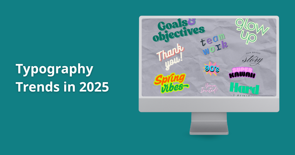
In 2025, typography is evolving with fresh, flexible styles that make your content feel modern and engaging.
Whether you’re managing a blog, designing websites, or curating social posts, these trends are worth watching.
Here’s what’s hot in typography this year and how you can use it to stay ahead of the curve.
1. Variable Fonts Are a Must-Have
Let’s start with flexibility. Variable fonts are exactly what they sound like: fonts that can adapt their weight, width, slant, or other properties, without needing to load multiple files.
Instead of using separate font files for regular, bold, and italic, you only need one.
This reduces page load time and keeps your site smooth, which is a win for SEO and user experience.
Why it matters:
- Perfect for responsive designs (especially mobile-first websites).
- Easier to maintain visual consistency across different screen sizes.
- Offers creative control without bloating your site with extra files.
How to use it:
- For web designers: start experimenting with variable font families like Roboto Flex or Inter.
- For content managers: check with your theme or builder if it supports variable font integration.
2. Bold and Playful Typography Grabs Attention
Bigger isn’t always better but in 2025, it’s definitely bolder. Designers are leaning into oversized headers and expressive letterforms that feel confident and fun.
From chunky sans-serifs to retro bubble letters, this style is all about stopping people mid-scroll.
Where it shines:
- Hero sections on landing pages
- Social media visuals
- Promotional banners and product launches
Tips:
- Keep it balanced. Use bold typefaces for main messages, and pair them with clean body text to avoid visual overwhelm.
- Don’t be afraid of color. Bold typography works even better when paired with bright or high-contrast palettes.
3. Retro and Heritage Fonts Make a Stylish Comeback
Everything old is new again. Retro typography channels vintage aesthetics—think 70s funk, 80s arcade vibes, and Y2K nostalgia. Heritage fonts, on the other hand, tap into cultural identity, evoking history and place through letterform.
Why people love it:
- Nostalgia builds emotional connection.
- It sets your brand apart in a world full of flat, minimalist design.
- It brings warmth and richness, especially when paired with textured backgrounds or analog visuals.
Use it for:
- Brand logos and packaging
- Event posters and merchandise
- Lifestyle brands targeting Millennials or Gen Z
4. Handwritten and Organic Fonts Feel More Human
In a digital world, people crave authenticity. That’s where handwritten fonts come in. Whether it’s a brushstroke script or a casual doodle-style serif, these fonts make your message feel personal and warm.
Organic typography is slightly more refined—it still looks hand-drawn but is designed with a natural flow that feels grounded and calming.
Perfect for:
- Wellness brands
- Food packaging
- Testimonials, quotes, or intimate blog sections
Pro tip: Don’t use handwritten fonts for paragraphs or dense text. They work best in short bursts—a headline, a label, or a note.
5. Kinetic and Temporal Typography Keeps Things Moving
Static design isn’t enough anymore. Kinetic typography adds motion to your content, from animated headlines to subtle shimmers in social posts.
Temporal typography is even more advanced. It changes shape, pace, or position over time to evoke mood and attention.
Where it’s thriving:
- Video content (YouTube intros, Instagram Stories, TikToks)
- Interactive web experiences
- Digital ads and product teasers
Use it wisely:
- Make sure it enhances your message, not distracts from it.
- Test load times. Some kinetic effects can slow down your site if not optimized.
6. AI-Enhanced Typography Is the Future
AI is changing how we work with fonts. From suggesting type pairings based on tone and audience, to generating entirely new font designs, AI tools are helping designers move faster and smarter.
Google’s Imagen 4 lets creatives bring visual ideas to life with generative AI, including choosing fonts.
What this means for you:
- More options, faster turnaround.
- Easier to create cohesive visual identities across platforms.
- Time-saving suggestions for non-designers working on social posts, websites, or ebooks.
Stay Visual and Stay Curious
Typography is a visual language. The best way to stay ahead is to keep your eyes open. Follow design showcases on Behance, Pinterest, or Instagram. Watch YouTube breakdowns on current trends. Try out new fonts, even if they don’t feel perfect at first.
Recommended Watch: Font Trends in Graphic Design 2024
This video explores typography in motion and shows how designers are applying these trends in real projects.
Conclusion
Let your fonts do the talking. Typography in 2025 isn’t playing it safe. It’s bold, personal, intelligent, and dynamic. Whether you’re rebranding, building a landing page, or creating content for social media, your font choices have the power to shape emotion and drive engagement.
Remember: Typography isn’t just about looking good, it’s about being understood.
