Key Takeaways:
- Improve accessibility by using strong color contrast, descriptive alt text, keyboard navigation, captions, readable fonts, and user testing to create inclusive digital experiences.
- Apply the WCAG’s four principles (Perceivable, Operable, Understandable, and Robust) as the foundation of accessible design.
- Embed accessibility into the entire design and development workflow through audits, reusable components, and consistent team training.
- Use real-user testing to uncover usability issues missed by automated tools and ensure designs meet real human needs and emotions.
Design is about access, not just aesthetics. If your product fails to work for everyone, it excludes users and harms both people and businesses.
Design accessibility ensures digital products are usable by all, including people with disabilities. It goes beyond compliance to build trust, improve clarity, and enhance user experience.
Use inclusive practices such as alt text, keyboard navigation, strong color contrast, and clear labels to make every user feel welcome and included.
1. Start with the Principles of Inclusive Design
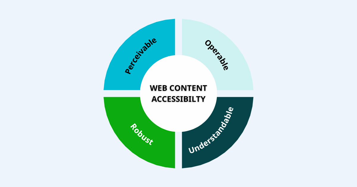
Accessible design begins with the four pillars defined in the Web Content Accessibility Guidelines (WCAG): Perceivable, Operable, Understandable, and Robust. These standards come from the W3C Web Accessibility Initiative (WAI), a global leader in defining reliable web accessibility guidelines. These pillars form your foundation. Everything you do should build on one or more of them.
2. Improve Color Contrast and Visual Clarity
Color is powerful. It conveys mood, guides the eye, and adds meaning. But not everyone experiences color the same way.
Low contrast makes content harder to read for people with low vision, color blindness, or even those in bright lighting conditions. Poor contrast isn’t just inconvenient, it is a major accessibility barrier.
Accessible design requires strong color contrast:
-
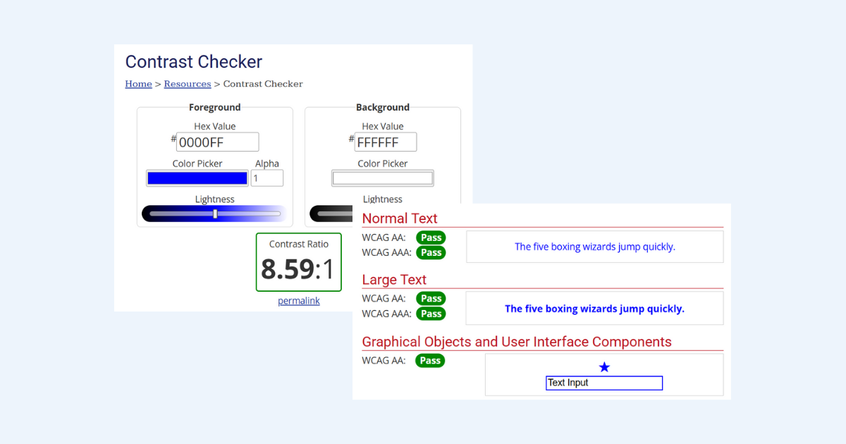
Use at least a 4.5 to 1 contrast ratio for body text against its background. This meets WCAG AA standards and makes sure text stands out clearly.
-
Use at least a 3 to 1 ratio for larger text or user interface elements like buttons and form labels.
Need a fast way to test contrast? Use free tools like WebAIM’s Contrast Checker. It is simple, accurate, and widely trusted by developers.
When contrast is right, everyone benefits. Text becomes easier to read, interfaces feel sharper, and your content reaches more people without frustration.
Good contrast is not about design perfection. It is about clarity, usability, and respect for how people really see the web.
3. Use Alt Text and Image Descriptions Strategically
Every image on your site should communicate not just visually, but textually too.
Alt text is how screen readers describe images to people who are blind or have low vision. Without it, these users miss the message entirely. From an SEO perspective, search engines also rely on alt text to understand what an image represents.
If you skip it, you don’t just create a gap in access. You lose visibility and context.
Here’s how to get alt text right:
-
Good alt text:
alt="Smiling team members gathered around a laptop"
This paints a picture and captures the image’s purpose. -
Bad alt text:
alt="image1"or leaving it blank
This provides no context and adds friction for screen reader users.
For purely decorative images, like borders or icons that don’t carry meaning, use alt="" so assistive technology can skip over them.
The goal is clarity. Imagine you’re describing the image to someone over the phone. What would you say? That’s your alt text.
Thoughtful alt text improves digital inclusion and makes your content more discoverable. It’s not just an accessibility feature. It’s a signal that everyone deserves to be part of the experience.
4. Ensure Full Keyboard Navigation
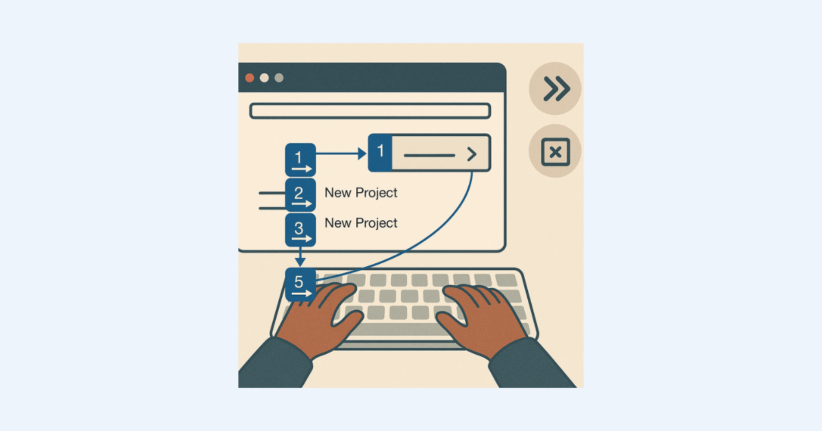
Not everyone uses a mouse or touchscreen. Many rely solely on the keyboard to explore the web, and your design needs to honor that. If someone tries to tab through your site but gets stuck, that’s not just friction, it is exclusion.
Here’s your quick test:
- Can you tab through every interactive element?
- Is there a visible focus outline?
- Do dropdowns and modals open and close with keyboard only?
Use semantic HTML like <button> or <a>, not <div>. Logical structure and focus travel make navigation usable by everyone.
5. Add Captions and Transcripts for Multimedia
Audio and video are powerful tools, but they are silent by default.
If your content speaks through sound alone, many users won’t hear it. That includes people who are Deaf or hard of hearing, those in loud environments, and anyone watching without sound. It also includes learners who rely on reading to better understand language.
To make your multimedia accessible and inclusive, always provide alternative formats.
What to include:
-
Closed captions for all videos
Captions display spoken dialogue and important sounds directly on screen. They support Deaf and hard-of-hearing users and help others who simply prefer to read. -
Transcripts for podcasts and webinars
Transcripts give users a readable version of everything that was said. They’re essential for accessibility, but they also help people skim, search, and quote your content. -
Audio descriptions for visual-heavy content
When visuals convey meaning like in a demo or tutorial. Use audio descriptions to explain what’s on screen. This supports users who are blind or have low vision.
Providing these elements doesn’t just improve access. It improves the entire user experience. People retain more, stay longer, and trust your content more when it meets them where they are.
And, transcripts and captions are great for SEO. Google can index written content, but it cannot “watch” or “listen” to videos. So when you include text versions, you help your content rank and reach more people.
6. Use Clear Layouts and Consistent Headings
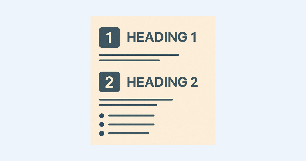
An accessible layout isn’t just clean, it’s calming.
When a page feels organized, people can focus. When it feels chaotic, they shut down. That’s why layout is more than design, it’s user support. Especially for those with cognitive disabilities, ADHD, or anyone who processes information visually.
Here’s how to structure your content so it works for everyone:
-
Use semantic HTML headings like
<h1>,<h2>, and<h3>in logical order. This helps screen readers understand the page and lets sighted users scan with ease. -
Keep paragraphs short. Walls of text are overwhelming. Two to three sentences per paragraph is ideal.
-
Break up content with bullets, line spacing, and clear section breaks. Structure invites clarity and clarity invites confidence.
This kind of formatting helps readers breathe. It creates a mental rhythm that makes information easier to absorb. Whether someone is using a screen reader, scanning quickly, or struggling with focus, structure gives them a way in.
When your layout is predictable, users feel safe. And when they feel safe, they stay.
7. Choose Readable Fonts and Support Resizing
Typography matters more than most people realize. It’s not just about how your words look, it’s about how they feel to your reader.
Fonts affect everything from readability and comprehension to how trustworthy your site appears. Good typography invites users in. Poor typography pushes them away.
- Prefer sans-serif fonts (Arial, Verdana)
- Keep body text 16px or larger
- Allow users to resize up to 200% without breaking layout
This isn’t just style, it’s an emotional experience. Clear text reduces frustration and builds trust.
8. Support Screen Readers and ARIA Labels
Screen readers rely on code that communicates meaning, not decoration. They interpret structure, roles, and labels to help users understand what each element does. If your code lacks clear semantics, the experience becomes confusing, frustrating, or even unusable.
Implement properly:
- Use semantic HTML (e.g., <button>)
- Add aria-label to icons
- Ensure dynamic updates trigger announcements (ARIA live regions)
- Sync form elements with <label>
Assistive tech users deserve respectful, usable experiences and so does your brand reputation.
9. Test Your Designs with Real Users and Tools
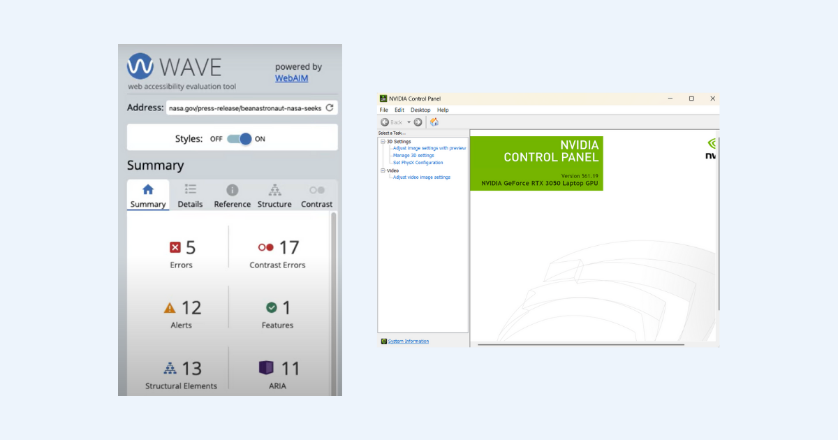
Automated tools are necessary but they can miss the emotional side of usability. They won’t tell you if a form feels frustrating or if a screen is mentally exhausting to navigate. Only real people can show you how your design makes them feel, think, or hesitate.
Use a combination:
- Audits with WAVE, Axe, Lighthouse
- Assistive tools like NVDA (Windows), VoiceOver (macOS/iOS), TalkBack (Android)
- Human testing with people who have real world needs
This is where user-centered design shines. It reveals issues you didn’t even know existed.
10. Build Accessibility Into Your Workflow
Accessibility isn’t a one-off task, it belongs in your process. It should be considered at every stage of the project, from initial concepts to final QA.
Make it a habit, not an afterthought, and you’ll avoid costly rework while building more usable products from the start.
- Include it in design & dev checklists
- Use reusable, WCAG‑compliant components
- Designate accessibility champions for code reviews
- Train every new team member
- Re-audit after big updates
Think of accessibility as part of your brand’s DNA, not a box to check.
Why Accessible Design Is Smart Business
You’ll see real results:
- Better SEO – Clear structure, transcripts, alt text, and headings boost search ranking.
- Lower bounce rates – Usable sites keep users engaged.
- Greater reach – Includes users with disabilities, aging adults, and situational limitations.
- Stronger trust – Inclusion builds credibility and loyalty.
- Legal safety – Compliance reduces ADA risk.
Accessibility is empathy and strategy in one package.
Real-World Example: Microsoft’s Inclusive Journey
Microsoft leads the charge. Its Inclusive Design Toolkit centers on real human diversity, not assumptions.
They:
- Design with exclusion in mind
- Include people with motor, visual, and cognitive differences
- Share tools like the “Inclusive 101” guidebook
- Build spaces like their Inclusive Tech Lab to test hardware and software together
Their approach shows that inclusive design doesn’t slow you down. It pushes innovation and shows real empathy.
FAQs
What’s the difference between accessibility and inclusive design?
- Accessibility removes barriers after they exist.
- Inclusive design anticipates diverse needs from the start—creating solutions that serve everyone.
Where do I begin?
Start with contrast, alt text, or keyboard checks. Then build from there, using WCAG as your roadmap.
Is accessibility only for people with disabilities?
No. It helps anyone with situational or age-related limitations. That’s why it improves UX for all.
What free tools can I use?
Check out WAVE, Axe, Lighthouse, and WebAIM’s Contrast Checker.
Will accessible design limit my creativity?
Quite the opposite. Constraints can spark better, more purposeful design.
Do I need a developer?
Not necessarily. Many fixes like adding alt text or adjusting colors can be handled by content teams.
Conclusion
Make every click count. Design accessibility is more than inclusive. It builds better products, better brands, and better humanity. It’s empathetic and strategic.
- Follow WCAG pillars in everything you do.
- Add real value with alt text, captions, and focus indicators.
- Test with tools and people.
- Bake this mindset into your routine.
One change at a time, and before you know it, your entire site is more welcoming.
