Key Takeaways
- Use color to influence emotion and action.
- Red creates urgency, blue builds trust, and green signals freshness.
- Choose colors based on your audience’s mindset, not personal taste.
- Use contrast to direct attention and increase conversions.
- Limit your palette to two or three main colors for clarity.
- Always test design choices to confirm what works in practice.
Make people feel something with just a hue by using color to trigger emotion, shape perception, and influence action. Color is not decoration, it’s strategy. It sets the tone, guides behavior, and can make or break engagement.
Build a brand, redesign a site, or launch an ad with intention. Your palette speaks before your copy. I’ve seen entire interfaces transform just by changing colors, conversions improved, bounce rates dropped.
Let’s break down how color works, why it matters, and how to use it to drive results.
What Is Color Psychology?
At its core, color psychology is the study of how colors affect human emotions and behavior. It’s rooted in both biology and culture. Red triggers alertness. Blue calms us down. Yellow energizes. These reactions happen before people even think about them.
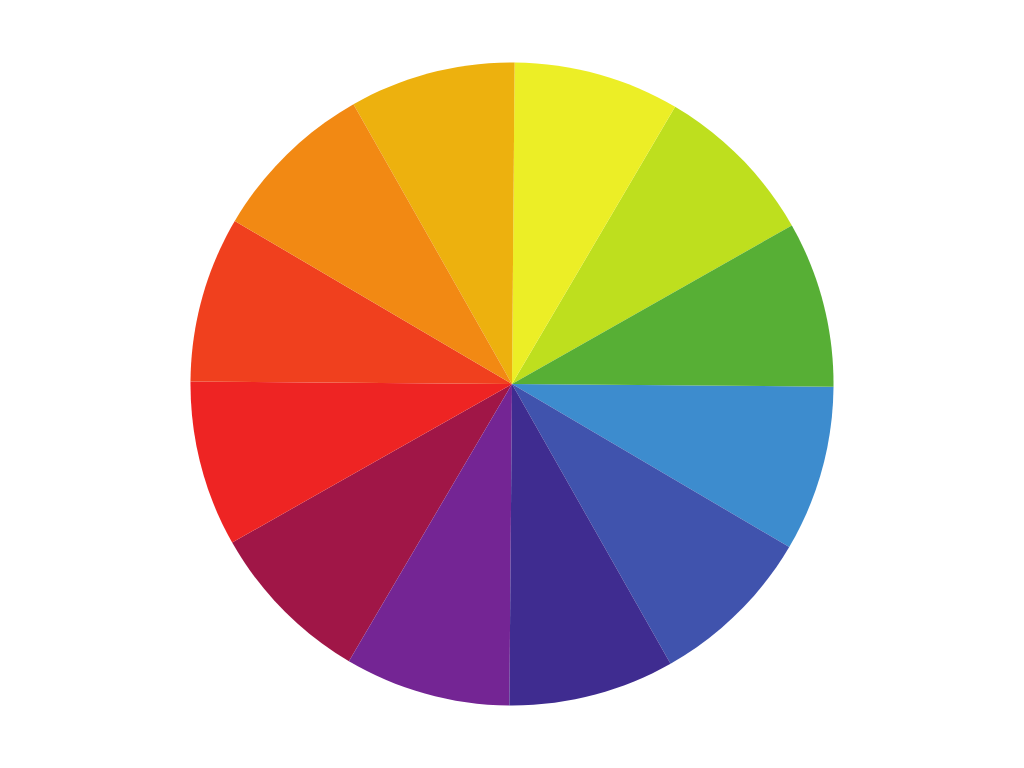
Here’s a quick cheat sheet of how different colors tend to make people feel:
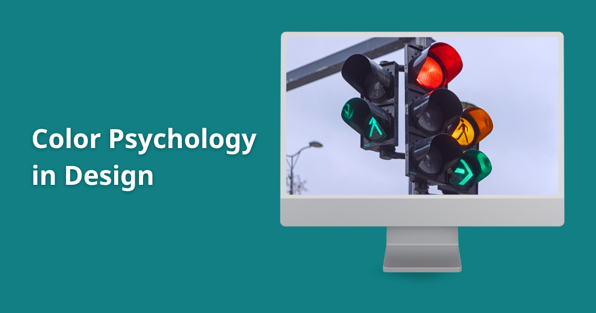
- Red: Urgent, passionate, bold. It activates. That’s why it’s used for stop signs, flash sales, and food brands.
- Blue: Trustworthy, calming, professional. Used by banks, tech companies, and healthcare services.
- Yellow: Happy, playful, energetic. But too much can be overstimulating.
- Green: Natural, fresh, balanced. Ideal for wellness brands, organic products, and sustainability-focused companies.
- Black: Sophisticated, powerful, sleek. Often seen in luxury and high-fashion branding.
- White: Clean, minimal, open. A go-to for modern websites, tech products, and anything minimalist.
Color psychology isn’t about rigid rules. It’s about using color with intention. Your brand might use red to signal warmth instead of urgency. What matters is the purpose behind the choice.
Why Color Matters in Web and Graphic Design
Design is communication. Color is one of its clearest voices. You might have the best copy, sharpest layout, and slick animations.
But if your color choices clash or confuse, people leave quickly. Color isn’t just a visual detail. It’s a core part of user experience.
1. It Guides User Behavior
Color tells people what to do. A bold, contrasting CTA button draws the eye instantly. Red means “act now.” Blue means “we’ve got you.”
When people land on a page, they don’t read first. They feel. And they feel color before anything else.
2. It Sets the Tone and Mood
A website for a meditation app in neon orange? Jarring. A high-end skincare brand with rainbow gradients? Confusing. Color creates the vibe. If you get it wrong, users leave before you’ve said a word.
3. It Strengthens Branding
Think of any iconic brand, Coca-Cola, Spotify, Airbnb. You can name their primary color instantly. That’s not a coincidence. Consistent color builds recognition. People remember visuals more than words. Use this to your advantage.
How to Choose the Right Colors for Your Design
This is where designers either shine or miss the mark. Choosing the right color isn’t just about what looks good. It’s about what works.
Here’s a step-by-step process to make smart, strategic color choices:
1. Know Your Audience
What are they looking for? What do they value? A Gen Z skincare brand might go pastel and peachy. A cybersecurity firm might stick to navy, slate, and steel. Design is about the user, not the designer.
2. Define Your Primary Color
Pick one main hue that aligns with your brand voice. This color should dominate your logo, CTAs, and key UI elements. Think of it as your visual signature.
3. Use Contrast with Purpose
Accessibility matters. Dark text on light backgrounds is usually best. But contrast also drives attention. Use it to highlight what matters, like buttons, links, and calls to action.
4. Limit Your Palette
Stick to two or three main colors. More than that, and your design can feel chaotic. Use accent shades sparingly, and keep the tones consistent. If your primary color is muted, your secondary colors should match that energy.
5. Test, Tweak, Repeat
Don’t assume your color choices are right. A/B test button colors. Run heatmaps. Look at user behavior. What looks good to you might not perform in real life.
What Not to Do
Some quick mistakes that still show up way too often:
❌ Using neon-on-neon. It looks flashy but feels like an eyesore.
❌ Matching text and background shades. Legibility always comes first.
❌ Blindly following design trends. Just because something looks cool on Dribbble doesn’t mean it works for your users.
❌ Using every color in the box. A rainbow layout screams “unfocused.”
Smart Color Combos That Work
Not everyone is great at pairing colors. Here are a few combinations that consistently work:
- Navy and Gold: Trust and luxury. Perfect for professional services.
- Teal and Coral: Energetic yet friendly. Great for lifestyle brands.
- Charcoal and Aqua: Clean and modern. Works well for SaaS startups.
- White and Forest Green: Calm and earthy. Ideal for health and eco brands.
Use tools like Coolors, Adobe Color, or Canva’s palette generator to explore combos without overthinking.
Conclusion
Color Is a Tool. Use It with Purpose. You don’t need to be a color theory expert to get this right. You just need to understand how colors make people feel.
That’s the power of color psychology in design. It lets you connect without saying a word. Color builds trust, drives clicks, and defines your brand. Be intentional. Be consistent.
Keep testing. Because great design doesn’t just look good. It feels right.
