White space in design is more than just blank areas on a page, it’s a powerful tool that can completely transform how your content looks and feels. From easier readability to better focus, the right use of white space can elevate any visual project. Building a website, designing a brochure, or creating a social media post all require a good understanding of how to use space effectively.
What Is White Space?
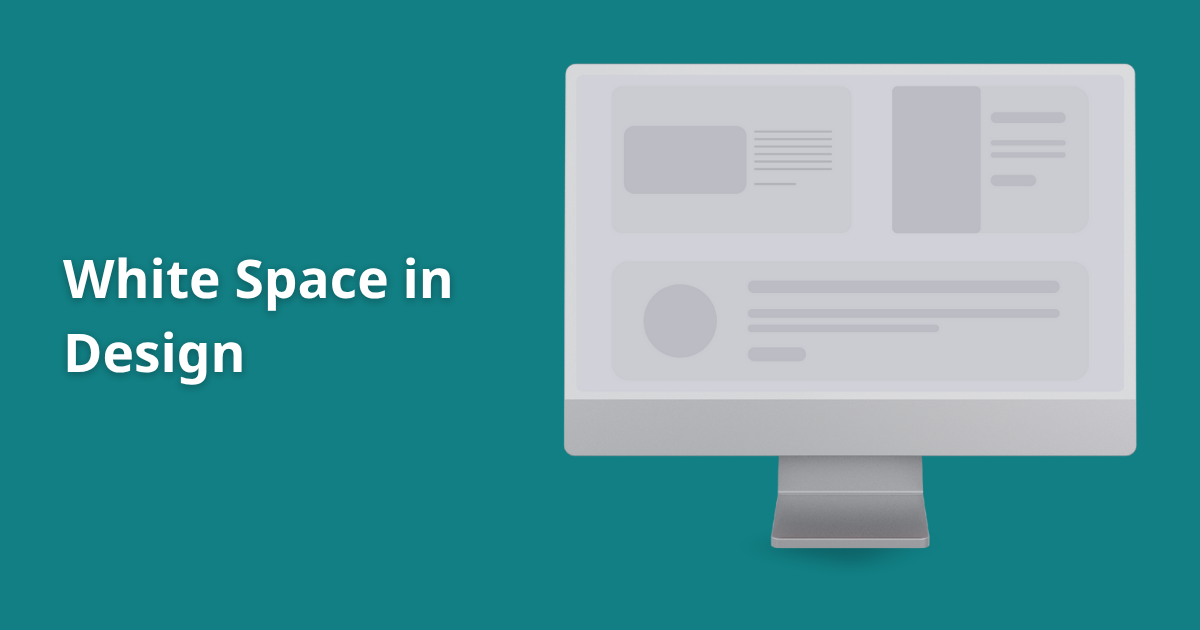
White space, also referred to as negative space in design, is any empty area between elements on a page. This includes the margins, padding around images, space between text lines, and even gaps between sections. It doesn’t have to be white, it can be any background color or texture.
Despite its name, white space is far from wasted space. It serves a crucial purpose: giving your layout balance and breathing room. When every inch of space is filled with content, it can overwhelm the viewer and make your message harder to absorb.
Why White Space Matters
Let’s break down the importance of white space and why professionals rely on it across all types of design:
1. It Makes Reading Easier
One of the biggest benefits of white space in graphic design is its impact on readability. When you give your text room to breathe with enough space between lines, paragraphs, and margins. Readers find it easier to process the information. Dense blocks of text can feel overwhelming, while well-spaced content looks more inviting.
In fact, designers often use white space for readability to guide the reader through content with ease. It reduces visual stress and keeps people engaged longer.
2. It Directs the Viewer’s Attention
Good design isn’t just about making something look attractive, it’s about communication. White space helps control where the viewer’s eyes go. It draws attention to key areas, like headlines, images, or buttons.
This is the foundation of visual hierarchy and white space. When used intentionally, space can guide someone from the headline to a call-to-action without any confusion or distraction. It’s a subtle way of saying, “Hey, look here first.”
3. It Makes Content Feel Premium
Think about the look of high-end brands. Their designs are often clean, minimalist, and well-spaced. That’s no accident. Using space wisely gives a design a more professional, polished look.
Applying design principles white space allows a layout to feel balanced and well-structured. It also builds trust. When something is easy to navigate and aesthetically pleasing, people are more likely to take it seriously.
4. It Works Especially Well on the Web
In the digital world, space is even more valuable. Whether you’re creating a blog layout, app interface, or homepage, white space in web design helps improve user experience.
Well-spaced elements mean less clutter and more clarity. People can quickly find what they’re looking for, reducing frustration and keeping them on your site longer.
If you want to see this in action, check out how platforms like Apple use spacing to create visually stunning and easy-to-navigate pages.
How to Use White Space Effectively
You don’t need to be a designer to understand how to use white space effectively. Here are some practical ways to start applying it to your work:
- Give margins room to breathe. Avoid cramming content up to the edge. Use generous padding around your content blocks.
- Space out your lines. Adjust line height and paragraph spacing so the text feels open, not squished.
- Group similar items. Keep related content close together and separate unrelated elements with space. This helps users understand the layout faster.
- Use fewer elements. Sometimes, the best way to add space is to remove things. Prioritize what’s essential and eliminate what’s not.
- Leave space around calls-to-action. Want your “Buy Now” button to stand out? Give it space. A cluttered design can bury it.
Even basic tools like Canva offer templates with built-in spacing suggestions, making it easier for non-designers to work with space properly.
White Space Examples
Some of the best white space examples can be found in minimalist brand websites, editorial spreads in magazines, and simple product packaging. These designs often do more by showing less.
Take the homepage of Google: it’s famously clean, with one search bar at the center and plenty of white space around it. This helps you focus entirely on what you came there to do—search.
Another great example is modern resume templates. Instead of stuffing everything into one tight block, the best templates use strategic spacing to separate skills, experience, and education into digestible sections.
White Space vs. Clutter
Here’s something to keep in mind: more content doesn’t always mean better. Filling every inch of a layout can actually work against you. People don’t enjoy navigating through walls of text or dodging flashing graphics just to find what they need.
That’s why minimalist design with white space has become so popular. It embraces simplicity, focusing on clarity and visual calm. The idea is to remove distractions and spotlight what truly matters.
Conclusion
In the end, the importance of white space isn’t just about aesthetics, it’s about functionality. Whether you’re designing for print or digital, white space in design makes your message more effective by guiding attention, improving readability, and giving your work a modern, high-quality feel.
So the next time you’re working on a layout and something feels off, try this: don’t add more to take something away. Create space, and let your content breathe. You might be surprised how powerful that “empty” space can be.
